


What makes visuals memorable
Client: Louboutin für L'Officiel
One question we get quite often is: How do I make my brand recognisable without putting my logo everywhere? Or, more honestly: how will they know it’s us if we don’t put the logo there?
Every strong visual identity has a thread — a colour, a shape, a recurring element that people learn to associate with you before they’ve even read your name. Louboutin’s is the red sole: a detail that’s technically hidden, facing the ground, invisible to everyone in the room except the person wearing it.
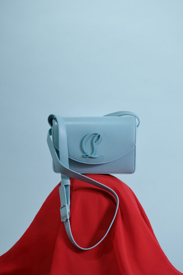
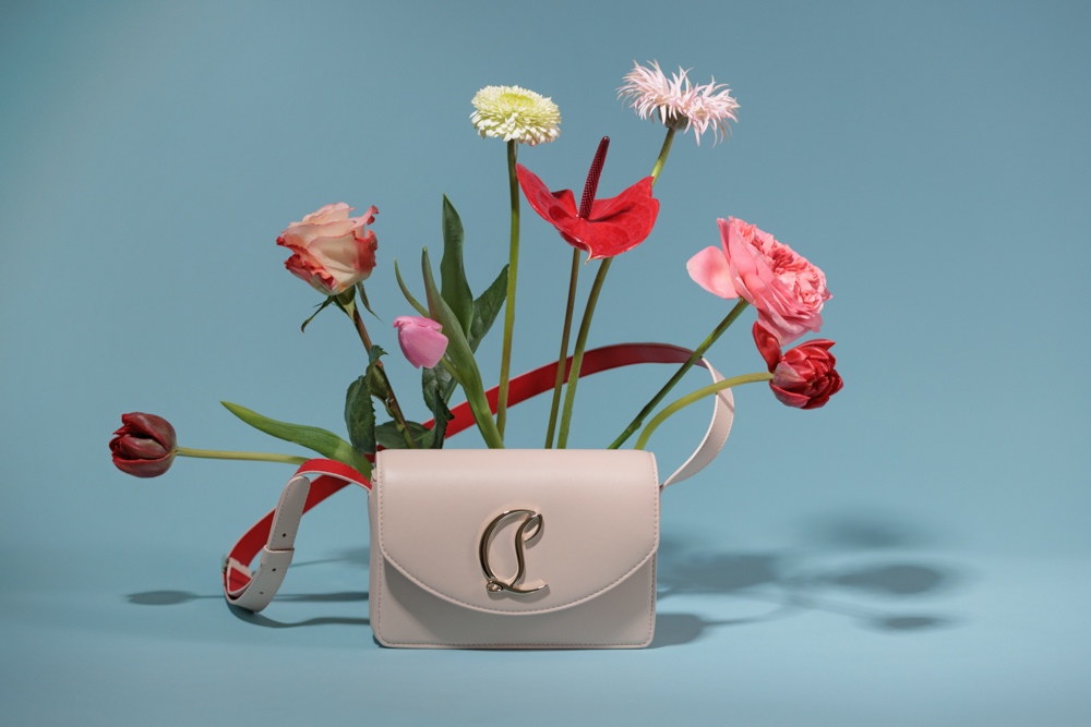
For this editorial we turned it over. Made it the set. Let it rhyme with the flowers, the arch, the fabric. The product was always the subject — but the signature was what held the images together.
Recognisable visuals are not accidental. They are the result of many small decisions that all point in the same direction. And a strong signature works twice: the people who knew it first feel like insiders. Everyone who comes later feels like they just found something worth knowing.
Intentionality. Every element in the frame — the surface, the prop, the colour, the negative space — should be a decision, not a default. Expensive-looking images are not about budget. They're about how much thought went into what's included and what's left out.
Give them one thing to hold onto. A colour. A feeling. A recurring visual element. Recognition creates memory and momentum. But also: Try to find a new and interesting angle on the topic you want to cover. A useful test before you publish anything: would you bring this up at a dinner party? Not as a promotion — as something genuinely interesting. Something you'd say "did you know..." or "I've been thinking about..." before. If the answer is no, it probably won't travel. Because the real signal that content landed isn't the like or the comment — it's the screenshot, the link sent to a specific friend, the post that ends up in a group chat. Content moves privately before it moves publicly, and it only moves if it's interesting enough that someone needs to share it with a particular person. That takes one clear throughline your whole content presence is built around, a format you commit to long enough for people to recognize it, and the discipline to say something real instead of something safe.
Because they're recognizable before someone reads the caption. Fast-growing brands on Instagram have usually solved one thing: visual consistency. Every image feels like it comes from the same world — same palette, same energy, same point of view. The algorithm rewards content that performs, but performance starts with recognition. People follow brands they can identify instantly in a crowded feed. If your grid looks like five different brands, growth will always be slow.
Two things: recognition and aspiration. People share content that makes them feel seen — "this is exactly what I think but couldn't say" — or content that makes them look good for sharing it. The first is about truth. The second is about desire. The brands that get shared consistently are the ones that tap into both — they articulate something real, and they do it beautifully enough that sharing it reflects well on the person sending it on.
Trends are useful as a temperature check — they tell you what the visual language of the moment looks like. But building your brand on trends means rebuilding it every six months. The smarter approach: understand the trend, then decide what your brand's version of it would look like. Or decide it's not for you at all. Both are valid. Neither is wrong. Chasing is.
When you could remove the logo and people would still know whose it is. That's the real test. Visual success is not engagement or reach — it's recognition. Does this image feel like it could only come from this brand?